Home
| What's New |
Features |
Gallery |
Reviews |
Reference |
Forum |
Search
Home
| What's New |
Features |
Gallery |
Reviews |
Reference |
Forum |
Search
|
|
|
Post
Shading by Russell M. Field
Giving a model a well-worn look is, for me, one of the most rewarding aspects of the hobby. With subtle signs of use and age, a model can take on a stunning aura of realism, as many of the works here on Hyperscale demonstrate very well. This article describes an alternative to both preshading and post shading with oil paints. While pre-and post shading can be used together, as can oils and pastels, I feel the scale I usually work in (1/72) lends itself best to a focus on one technique or another. Larger scales offer opportunities for more combination of techniques, and may require some adjustment for scale effect.
The primary effects achievable with chalk pastels are applied to areas rather than specific features or details. The nature of the material does not lend itself to draftsman's lines or small points. I group these effects into five major categories:
Keep in mind that grunge and stains have a kind of layered priority, like hydraulic fluid streaking over a dirt-stained surface or cordite residue over a faded and chipped leading edge. Proper sequencing will help keep your model looking more realistic. Like anything, these effects can be overdone. Get a good idea what you want the finished product to reflect before you start. Especially in the smaller scales, it is unlikely that more than a couple of these categories will be appropriate. Enthusiastically applying all four to a 1/72 piece would very likely give it unrealistic contrasts and detract from an otherwise superb modeling effort.
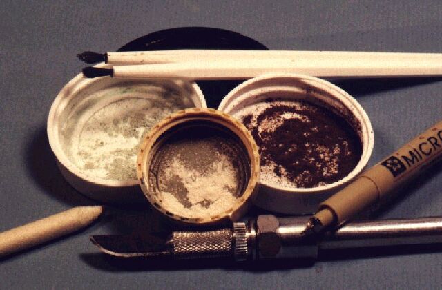
These are the tools I use to create the faded, operational effects with chalk pastels:
Clockwise from the top: small brushes, ultra-fine point black marker, scalpel, artist's blending stump and powdered chalk pastel mixtures. Taking these in order, the brushes I use are fairly stiff, though not hard. I use them solely for pastel work, and pretty much just to deposit chalk dust on the surface in the area(s) I want most dense. The ultra-fine point marker is used on a gloss surface (important note there; semi-gloss or flat will trap the ink more quickly and may cause problems) to highlight portions of panel lines. Note that I said PORTIONS, not an entire line. This gets the idea across without overemphasizing the fact that there's a line there; it creates more of an impression than a statement (if that makes any sense … must be getting close to Cuervo time …). I I'll line about a quarter of an inch and IMMEDIATELY lick my thumb and run it across the line at a 90 degree angle to remove most of the ink before it sets up (how's THAT for a high-tech tool - a spittle-covered opposable digit?). Experiment with different brands of markers on "test units" before committing on your latest gem, because some marker brands become permanent more quickly than others and a sloppy line may not be easily corrected. This picture shows a model before shading/fading, but with panel lines lightly accented with the marker:
The scalpel is used to scrape fine powder from the pastel sticks. If the resulting dust is not fine enough, you may want to grind it some more with a scalpel handle or other pestle. IMPORTANT NOTE: you MUST use chalk pastels for best effect; oil-based pastels won't do the trick! The blending stump is one of the most versatile and useful tools I have for final finishing. Made of compressed paper, it is soft enough that it won't mar surfaces but hard enough to blend and burnish. Like a brush, it can be used to drag colors out for a feathered edge or draw them together for a mixed interface. I like to use one for applying the pastels and dragging them out, and a cleaner one for feathering the edges. A used stump retains some of the pastel dust, and can be used for faint shading and touch-up without additional powder. As for the pastels, you can get a wide variety of colors and use them either as is or mixed to match shades or tints you want to apply. Again, use CHALK, not oil pastels.
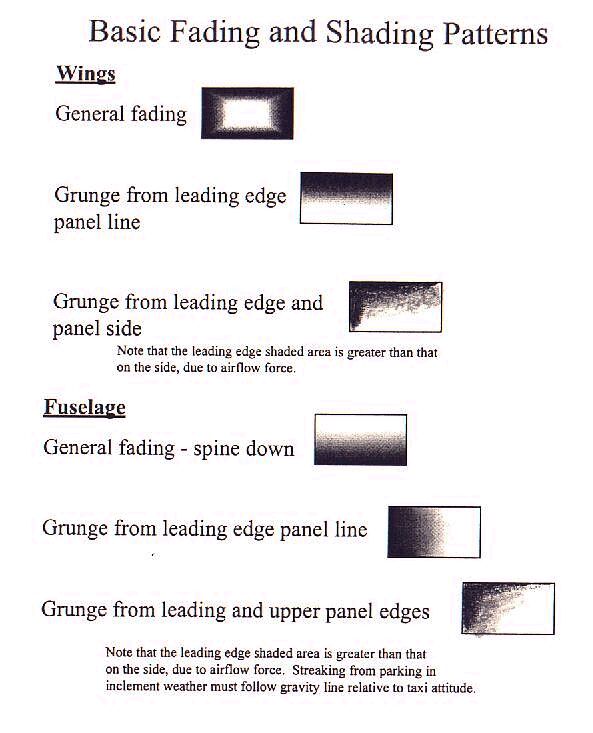
There are a few basic patterns you can use, depending on the area you're working on and the effect you want to achieve. You can apply them to individual panels or to general areas; in the latter case, you might have two or three areas covering several individual panels. Here are some ideas:
Again, which pattern(s) are appropriate will depend on what you're trying to represent or want to emphasize. If you want to depict a relatively clean plane that's been used but cared for, then the general fading patterns would be fine. If, however, your subject has been flying quick-turn-around sorties or has not been detailed in a while, the grunge patterns may be better. Of course, you can mix and match as well, using darker chalk on the leading edge panel lines to simulate grunge flow and lighter shading on the trailing panel edge just to highlight the area. I think mixing like this is more effective on the larger scales; on 1/72 at least, it tends to make the unit look too busy for my eye.
After some experimentation, I find that I get the best results applying pastels to a dead flat finish. This means:
Generally speaking, I like to fade the areas I'm highlighting before shading anything. This entails using very light chalk, either white - which is often too stark - or better yet, white mixed with a little chalk matching the base color(s). Special attention should be paid to the colors used and the amount applied when fading insignia and other decals. Fading is followed with shadowing if that's part of your plan. I do very little shadowing in 1/72, either on planes or armor. I tend to simulate or deepen shadowy areas with an oil or watercolor wash instead. Shading is the next step, to get the basic airframe looking weathered and perhaps to highlight certain areas. This is followed by operational grunge and staining, keeping in mind that some "grunges" will overlay others. For example, gunpowder stains will be on top of dirty panel lines even if they don't totally obscure the lines themselves. When all the dust settles (so to speak), I like to seal it all with a light overcoat of clear flat. The pastels adhere well enough on the flat surface they're applied to that I've never had a problem washing them off with the overcoat. Applied to gloss or semi-gloss surfaces, the pastel coatings would be much more fragile and likely to rub or wash off when not intended.
This sequence illustrates the basic technique I use.
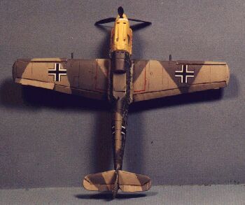
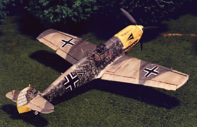
Here's a 1/72 Me 109 I used this technique on (you knew I was gonna sneak one of my projects in here, didn't you?). The first pic shows the port side and spine faded and the starboard side untouched except for lining:
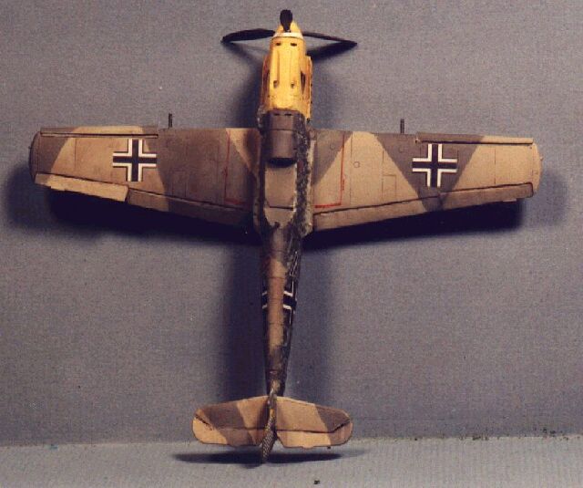
Here we contrast the faded starboard side with the port side, which has now also been shaded:
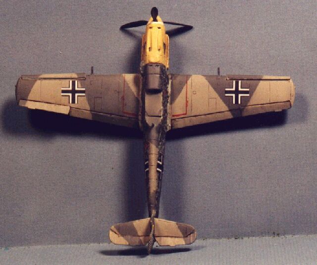
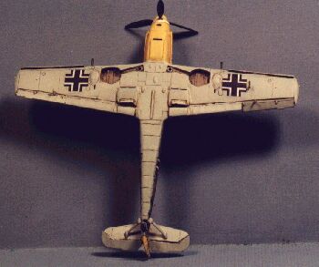
On the left is the upper surface before any fading or shading; compare that to the shot on the right, where all fading, shading and operational grunge has been applied:
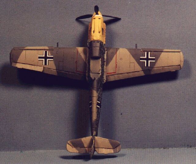
And the shots belowcompare the underside before and after treatment. Note that fading is not an issue on the under surfaces:
Study lots of pictures, paintings and drawings to learn where your subject is prone to leaks, wear and staining. Then try post-shading with pastels to achieve some of these effects, and I think you will be pleased!
Article, Model and Images Copyright © 2000 by Russell
M. Field
|
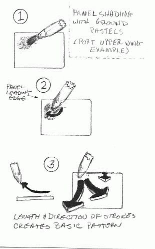 Step
1 - I dip a brush in powder and dribble it where I want the most
concentration of color. If I'm fading the center of a panel, an insignia or a
general area, I'll drop chalk in the middle; if I'm shading a corner or edge,
I'll concentrate the powder there. (You can use the blending stump for this
application, but I feel I get better control with the brush as I can always
blow off any excess before I rub it in.)
Step
1 - I dip a brush in powder and dribble it where I want the most
concentration of color. If I'm fading the center of a panel, an insignia or a
general area, I'll drop chalk in the middle; if I'm shading a corner or edge,
I'll concentrate the powder there. (You can use the blending stump for this
application, but I feel I get better control with the brush as I can always
blow off any excess before I rub it in.)